











A guest who stops at the entrance and asks where check-in is has already found a gap in your event plan. At a packed New York venue, that small delay can turn into a bottleneck, late arrivals, and staff pulled away from more important work. Effective event wayfinding design gives people clear direction before they need to ask.
For trade shows, corporate meetings, product launches, community events, and pop-ups, wayfinding is not one sign at the door. It is a coordinated set of visual cues that moves attendees from the street to registration, from registration to the right room, and from the main event to exits, restrooms, activations, and pickup areas. The goal is practical: fewer questions, faster traffic flow, and a more organized event floor.
Event Wayfinding Design Starts With the Guest Route
Start with the actual path attendees will take, not the venue floor plan alone. A floor plan shows what exists. A guest route shows where people may hesitate, make the wrong turn, or gather in a crowd.
Walk the route as if you have never visited the space. Begin at the subway exit, parking garage, lobby, or building entrance. Identify every decision point: the first door, elevator bank, registration desk, hallway split, escalator, ballroom entrance, and exhibit aisle. Each point needs a clear answer to one question: where do I go next?
This is especially important in multi-level venues. A sign that says “Conference, 3rd Floor” may be technically correct but still leave guests looking for the elevator. Better direction pairs the destination with an action: “Conference Check-In - Elevators to Floor 3” or “Expo Hall - Escalator Down.”
For outdoor activations, account for sightlines from a distance. Guests may arrive from different corners of the block, and city foot traffic does not always approach from the direction you expect. Tall flags, branded tents, and large vinyl banners can establish the arrival point before a smaller directional sign handles the next step.
Build a Sign System, Not a Collection of Signs
Wayfinding works when every sign follows the same visual rules. Use a consistent color palette, typeface, arrow style, icon set, and naming convention. If “Registration” becomes “Check-In” on another sign, attendees may assume they are different locations.
Keep the most important information large. A directional sign is not the place for a full event description, sponsor list, or marketing paragraph. The destination and arrow should be readable in a few seconds while someone is walking. Secondary information can sit below it in smaller type.
Color can help guests recognize zones quickly. For example, blue can identify conference rooms, orange can identify the exhibit floor, and green can identify exits or guest services. This works best when color supports plain-language labels rather than replacing them. Not everyone will remember that orange means exhibits, and some attendees may have color-vision limitations.
Arrows deserve more attention than they usually get. Use one arrow style throughout the event, make it large enough to see, and place it beside the destination it refers to. Avoid signs with several arrows pointing in different directions unless the location truly requires them. At a busy intersection, separate signs can be faster to process than one crowded board.
Choose Formats Based on Location and Traffic
The right printed format depends on where the sign will be used, how long it needs to last, and whether it must move during the event. A lobby has different needs than a sidewalk, a trade show aisle, or a temporary registration area.
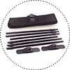
Retractable banner stands are useful for check-in lines, ballroom entrances, sponsor areas, and session schedules. They are portable, stand on their own, and can be repositioned when traffic patterns change. They are a strong choice when the event team needs signage that travels from one venue to another.
Rigid signs work well where guests need a fixed directional message. Mounted foam board, PVC, or similar rigid materials can be placed on easels, walls, counters, or stanchions. They are practical for arrows, room names, QR instructions, menu boards, and pickup notices. If a sign sits near a door or hallway corner, rigid material often reads more cleanly than a loose poster.
Vinyl banners handle larger, high-visibility directions. Use them for building entrances, registration backdrops, loading zones, outdoor routes, and broad messages such as “Event Entrance This Way.” Grommets, pole pockets, and finishing options should match the installation method before production starts.
Floor decals can direct a queue or guide guests through a large space without adding more sign stands. They are useful for registration lines, exhibit paths, and retail pop-ups, but they need proper surface compatibility and safe placement. Do not rely on floor graphics alone in a crowded room where people may block them from view.
For a busy event, the most effective setup often combines formats: a large entrance banner, a sidewalk flag or directional sign, retractable banners at registration, rigid signs at interior decision points, and small counter signs where guests need specific instructions.
Put Signs Where Decisions Happen
A sign can have excellent design and still fail because it is placed too late. If attendees only see “Registration” after passing the registration desk, the message did not do its job.
Place directional signs before the turn, not at the turn. Give people enough time to read, process, and change direction. The distance depends on crowd speed, hallway width, and viewing angle. In a fast-moving lobby, a larger sign farther back is often better than a small sign directly beside the door.
Also consider what competes for attention. Venue signage, digital screens, sponsor displays, architectural columns, and other events can bury your message. If an area is visually busy, increase contrast, simplify the copy, or use a taller format that rises above the crowd.
Registration deserves special treatment because it is usually the first high-pressure point. Clearly separate lines for general admission, VIP, exhibitors, speakers, press, or on-site registration. If one desk handles multiple groups, place signs at the beginning of each queue rather than only above the table. Guests should know where to stand before they reach the front.
Design for Real Event Conditions
Wayfinding needs to work under the conditions people will actually face: dim lighting, long lines, rush-hour arrivals, bad weather, and last-minute room changes. A beautiful mockup viewed on a laptop does not show whether a sign can be read across a crowded foyer.
Use high contrast between the background and lettering. Light text on a dark background or dark text on a light background is generally easier to read from a distance than low-contrast brand colors. If your brand palette is subtle, reserve it for accents and use a clearer field behind key directions.
Keep type sizes proportional to viewing distance. Signs read from across a room need large, simple lettering. Signs at a check-in table can carry more detail because guests are already standing close. Script fonts, thin strokes, and tightly packed text may fit a brand style, but they are poor choices for directional information.
Plan for updates. Events change quickly: a panel moves rooms, a sponsor activation opens late, or a loading entrance closes. Modular signs, replaceable inserts, and a small batch of blank directional boards can save time on event day. For urgent changes, same-day printed rigid signs or banners can keep the guest experience on track without redesigning the whole system.
A Production Checklist Before You Print
Before sending artwork to print, confirm the details that create the most event-day problems:
- Verify every room name, floor number, entrance, and arrow direction against the latest venue plan.
- Confirm finished sizes, viewing distances, and where each sign will be installed.
- Check whether signs need stands, easels, grommets, adhesive backing, stanchion clips, or weighted bases.
- Review venue rules for wall mounting, floor decals, outdoor displays, and fire exits.
- Produce a placement list so the setup crew knows exactly where each sign belongs.
Make Branding Support Direction, Not Compete With It
Event graphics should look branded, but wayfinding is first a functional tool. A large logo can establish ownership at the entrance or on a step-and-repeat backdrop. Once attendees are moving through the venue, the destination should take priority.
Use branded elements consistently around the edges of directional signs, on header bars, or as a footer. Keep the center area focused on the location, arrow, or action. Sponsor logos can be included where required, but avoid shrinking the directional message to make room for a crowded logo row.
For New York events with short lead times, production choices matter as much as layout. Print Banners NYC can produce event-ready banners, retractable stands, rigid signs, decals, flags, and display hardware for organizers who need a coordinated set of visuals on a fast schedule.
The best wayfinding is rarely the sign people remember. It is the sign that gets them to the right place without slowing down, asking staff, or missing the moment they came for.